UI - UX
General / Scattered thoughts
- Error / Info messages > Disabled buttons > Hidden buttons
- hiding UI elements can be useful in complex environments to filter non-applicable items
- however keep in mind that making an element unavailable or unclickable always comes with the user asking himself "where is that button I used a minute ago?" or "why can't I click this now - I could before?"
- if you are hiding or disabling elements, it should be totally obvious to the user why that is the case (or you could tell him in a hover text)
- bad counter example: Photoshop disabling certain options when image uses indexed color mode or the layer mask is selected instead of the image or not doing anything when deleting a selection on a layer that is hidden (not even an error message)
- Provide a search option, if your program has lots of options or settings
- I think for modern programs this should always be a default. An in-program fuzzy text search over all features, settings and commands is much more powerful than an external (or even internal) documentation/help.
- It keeps the user in the program and in flow, since it can be navigated quickly from keyboard only.
- This also brings one big advantage of the terminal to GUI applications: You cannot copy GUI actions (click here, then this menu opens, scroll down, click that button), but you CAN copy text commands from
stackoverflowChatGPT into a command search - Good examples: Sublime Text's
Ctrl + Shift + P, RadDBG'sF1
- Provide feedback
- Clicking a button should do something
- If the user does an action, there needs to be a response. If the computation takes longer, show a progress bar (but also consider moving that action to a background thread, so the program stays operable)
- Don't overuse animations
- They can be handy to direct the users attention
- They can make an interface feel more smooth
- Be mindful: They increase complexity of the code, since you now have "intermediate" state and lerps you need to track. To keep things simple, just keep an "actual value" and an "animated value" - first one is for computing, second only for drawing.
- If you include them, make them fast and snappy. Don't waste the user's time. lerp with a high t value can be a good choice.
- I generally don't like animations, but some people do. This might be an area where customization options shine (speed of animations, on/off toggle).
- The user should always be in control
- Avoid modals (this includes error popups) - these break control flow
- Make long operations cancel-able
- Undo/redo
- Avoid waiting time (animations, etc.)
- Respect what the user has entered and do not edit it without his consent (e.g. do a validation pass when the user has clicked submit on a form and highlight or correct errors then. Don't edit while the user is typing, show errors at maximum then)
- Config options, window customization - with good defaults (see below)
- Treat the user as a intelligent individual with agency
- Give the power to do complex stuff
- don't oversimplify the interface, alternatively provide an "expert" mode (but be aware that this doubles the amount of work and code paths, so you probably want to avoid it)
- Give background/developer information the user can use to diagnose problems (googleable). Maybe hide those in an optional text box, but never remove them
- Make clickable elements obvious as such
- Text hyperlinks are for the web, not UIs
- Use well known elements, don't re-invent the wheel
- create fancy new controls only if they provide a clear benefit and are absolutely necessary
- Users interact with tons of UI every day. They don't have time to learn something new
- Provide meaningful defaults
- provide a good experience out of the box
- Config options are nice, but don't make them necessary
- Consistency is key
- Keep a clear structure to your UI (main navigation, position of nested elements, etc.)
- Don't make one element do multiple things in different contexts (or make it very obvious, if it is totally necessary)
- The less screens information is scattered on, the better
- Screens should not be overcluttered with buttons and information, but should not be too simple either as to require a lot of popups and screen changes
- Every screen change removes context and makes it harder to follow
- Whitespace
- less is more: make all meaningful content actually fit the screen. Don't require popups or scrolling
- cluttering: it takes a lot to be cluttered, just group elements together in a meaningful way and thinks keep being organized even with much on the screen
- add whitespace around elements only for touchscreens (different ui concept, different problems)
- Load times and memory usage
- This matters more than you think.
- Low-end consumer screens operate at 60Hz (60 images per second), high end screens in 2025 are up to 500Hz. Modern phone screens are usually 90 or 120Hz. This is because lag and jitter are noticeable and degrade the experience. Higher refresh rates provide a smoother experience and the users notice that, so your program should run in at least 60fps all the time.
- Modern computers are really fast. Load times for most programs should be non-existent (SSDs load files at multiple GB/s, CPUs execute millions of instructions every second). You have no excuse.
- Having invisible load times enables users to iterate and try features more quickly.
- Waiting is annoying, nobody likes looking at a progress bar or spinner. Using a fast and snappy program just feels better and is more fun, generally a better UX.
- Bullshit detector: If your program does a simple task, it should not take hundreds of MiB of disk space. Bad example: Balena etcher (170MiB program for writing an image to a flash drive vs the GNU tool dd which is 68KiB and does the same job)

Concurrency
https://www.youtube.com/watch?v=Tvms2DaG8UY
- UI becomes 10x harder when the web or any server is involved
- requests can get lost or delayed, so UI can become out of sync
- Including updates state in POST request: can be inconsistent, when earlier request out of multiple is delayed and applies old state on return
- updating after POST: adds another round trip to the server (lag), plus possible inconsistent updates/jitter in between multiple request (but at least good state at the end)
- more problems when infrastructure is scaled (state needs to be synced between servers)
- timestamps are also tricky, since you need to carefully design at what moment to take them
- big problem: non idempotent changes like shopping checkout, which should only be handled once
- possible solution: causal ordering. Include dependency on request 1 in data of request 2 and handle on server
- generally: update UI locally to show immediate feedback, do not wait or block, update when corrected data arrives
- generally: solution is trade off between solving state sync problems and managing concurrency with stateless sources
User Error
- What is user error: Clicked the wrong button, hit the wrong key, etc.
- Result: An unwanted slow operation starts, something is deleted or added without intent, etc.
- This happens, but it's the 1% case.
- Handling this case should not be the default.
- Don't slow down the 99% to handle this case. Do not break the flow of a user on the correct path.
- 10 usability heuristics by Nielsen - Factor 3 User Control and Freedom
- User action should be reversible
- User has to be able to exit the unwanted state quickly without additional confirmations
- Errors happen, but it's better to give an "Undo" than to ask for confirmation every time.
- Consider how likely the error is and how bad the result if it is triggered without intent
- If a dangerous action can be triggered easily (for example by being one pixel off when clicking the "save" button and hitting the "exit without saving" button next to it), it's more sensible to ask for confirmation than if the user has to hit a very specific keybind to trigger this state.
- But also: don't put the dangerous option right next to the harmless one.
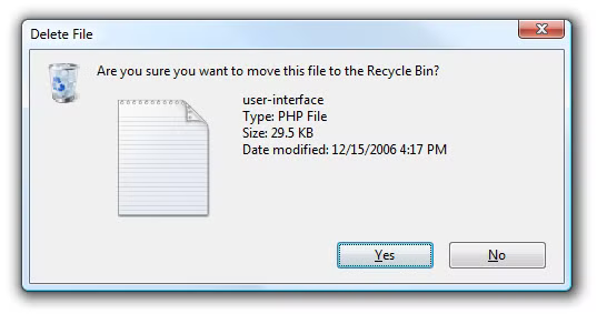
- Modern Windows delete dialog mostly gets this right imo (even though it gets a lot of hate): Moving files to the recycle bin does not prompt for confirmation by default (though you can enable it) and you can undo it easily (through Ctrl + Z or context menu). Deleting a file permanently does prompt for confirmation and is not reversible. That is sensible in my eyes.
- Even though to delete it permanently you have to hit Shift + Delete, which probably never happens accidentally (and Windows really should have a recycle bin solution for remote drives by now).
- Programs that ask for confirmation before closing when there are unsaved changes.
- This okay, but a better solution would be to just save these to a "session" file and re-open them automatically on next startup (a welcome change in Windows 11 Editor and most modern text editors).
- This implies that saving and loading is instant, which it should be in most cases! (if it is not, you can still ask "Hey there were unsaved changes on last exit, do you want to load them?" on startup)
- Try to reduce user error in general
- Use the right affordances to communicate cleanly
- If there are multiple ways to interpret an action, but only one leads to the right solution, default to that one
- Group actions sensibly
- Use commonly understood UI elements in their intended way (don't use them out of context or assign new meaning to them - for example I HATE when a program minimizes to tray when I try to close it)
- Provide context help
- Provide a cancel action when an operation might take longer than 500ms (kind of an arbitrary value, but most monitors are running at 60Hz, so 30 frames is clearly noticable lag, human reaction times are generally 200-500ms, so this is enough time to react and actually hit cancel)
- Avoid error messages by handling everything you can (which is more than you think). If you cannot handle an error internally, provide (meaningful) error messages
- This does not help anyone:

- Tell the user exactly what went wrong
- Ideally include a hint on how to fix the error
- Make the error message easily googleable (use descriptive keywords, make the text copyable - old Windows error dialog boxes copied the whole content to clipboard when the user pressed Ctrl + C)
- If you fear overly technical terms might scare the user, first reconsider the user as a competent individual, second if you are still unsure hide additional details "for nerds" behind a "more info" dropdown
- This does not help anyone:
Dropdown hell
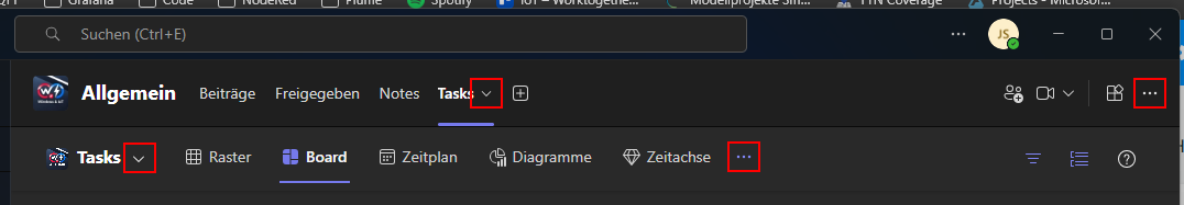
Microsoft Teams in general is a shitshow, but UI-wise this one takes the cake so far.
I wanted to open a taskboard in a new window and was left with 4 different dropdown menus which might apply to this task (not counting the 2 other dropdowns, which I already knew about and eliminated based on that). Initially I only found 3 of them and neither worked, so I gave up. The correct one is the second from the left btw.
So, for any feature without a button on screen, you might have to look through 4 different invisible menus...
Granted with a bit of thinking, I can see where the individual menus are coming from. But would it not be a good idea to at least combine the two menus on the same row?